Back to projects
I decided not only to give my website a new look, but also to expand its functionalities.

Purpose and goals of the redesign
I decided not only to give my website a new look, but also to expand its functionalities. This idea aligned with my decision to refocus my career on the technical aspect of building software solutions. As I was always working in interdisciplinary roles whilst applying both technical but also subject-specific knowledge, I wanted to showcase some of my works but also to write about what keeps me busy all day long. Additionally one of the purposes of this website was to showcase who I am and what my aspirations are.
These aspects layed the foundation of the redesign of my blog as the old version of this website was not capable of covering these aspects in all its facets. Thankfully I was able to retain many features of the old blog but I had to work them out more thoroughly as the old website was more of a side project I created in a limited amount of my time.
One of the key challenges was ensuring the site was mobile-friendly and visually appealing across all devices. I also had to streamline the navigation to make it intuitive and user-centric. With the increase in content, I needed to ensure the website structure would remain organized and easy to navigate. Another challenge was the design of the website, which had to be less generic and more expressive of my style, vision and personality.
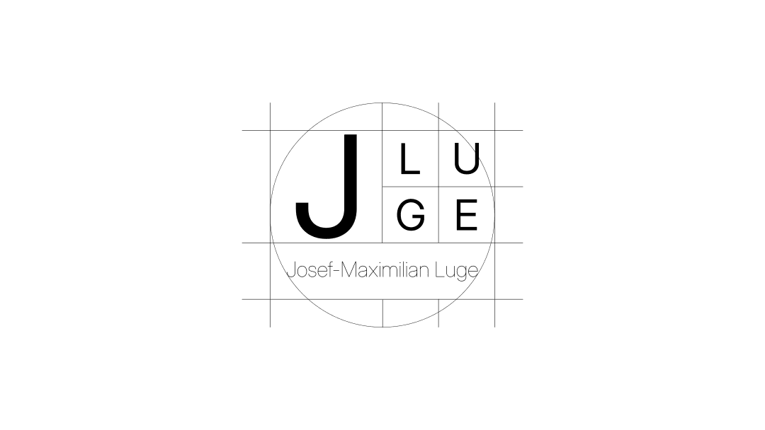
Logo Concept of the website
The logo of the website uses typography only in order to be clean and minimalist. The font is Inter as this font family is simple. the main area has medium sized letters while the subtitle is light in order to draw the attention on the main part. By avoiding bold typography there is a subtle elegance introduced to the overall look and feel. The elements are positioned by squares in a harmonic and simple way. By incorporating circles to center the name below the main design it is more approachable and and balanced out.
The process
To come up with a result which would match my upfront expectations, I layed out a plan which involved several key stages. This approach helped me to concentrate my creative energy on the key challenges and solving them step by step.
- Research and Planning: I started by analyzing user behavior on the old website and gathering feedback to identify pain points. I also researched current web design trends and similar websites to stay updated.
- Wireframing and Design: Using tools like Figma and Inkscape, I created wireframes and mockups for the new site structure. The design emphasizes clean typography, spacious layouts, and a more visual-centric approach.
- Content Strategy: With the goal of improving engagement, I added new sections such as a dedicated blog page, project case studies, and a contact form. Content was optimized to cater to both users and search engines.
- Development: I used HTML/CSS, JavaScript and Typescript to bring the design to life. I focused on speed optimization and responsive design.
- Testing & Launch: After completing the redesign, I tested the site across multiple devices and browsers to ensure consistency and performance. The site was launched after final adjustments were made.



Key features of the relaunch
With the relaunch came several features such as the new About section which bundles not only information about me and what I do during my day off work but also showcase more of my professional expertise than the old website did. The new Projects layout allows the user to get more insights into my works than before. The project description features richer content and also aligns with the minimalist approach to provide better navigation. The new top navigation now sticks on the upper bound of the window and allows quick access.
The search bar on top features now a logo on the right which leads the user to the home page intuitively while providing access to the rest of the pages in the middle. On the right side are specific actions which enable control over the side. These actions are a detailed search bar and a button which changes the theme of the site. Also the footer received some updates and now features more detailed descriptions of the privacy policy and terms of use to provide insights how cookies and analytics are used to provide a better user experience. This is how the site’s navigation is more intuitive, allowing users to find content quickly.
Mobile and search engine optimization
A key aspect of the new design was the performance and optimization for mobile screen sizes as 71.43% of all visitors accessed the webpage via smartphones and tablets. This meant that I needed to adjust my design system to three screen widths. A major concern was the typography as it stands out due to the lack of major design elements on the site. Another focus was the optimization of images throughout the website to achieve fast loadtimes and enhance performance based on the screen size.
These changes came along with SEO optimization which proved to be more challenging than it was on the old page layout. I integrated more animations and use framer motion as my library to save me work on CSS. But with this change I had the constraint to render more elements of my website on the client which decreased performance and made it more difficult to create metadata for certain elements of my site while building it on the server. This is why such elements are almost always integrated in server side elements.
Minimalist design system
The website features a minimalist design system to communicate clarity, confidence and intentionality. It expresses traits like professionalism, modernity, and attention to detail, as I value substance over embellishment. Moreover I wanted to use a minimalist design approach to convey openness and honesty, as there's less distraction and a clearer focus on the person or the message behind the website.
The approach I used was all about simplifying both visual elements and user interactions to create a clean, intuitive experience. This approach reduces clutter, focusing on essential content and functionality. By using ample white space, limited color palettes, and clear typography, minimalist websites prioritize readability and ease of navigation, enhancing user experience. In my case the only accent color is a blueish tone which is used decently to highlight important text passages across the headings to guide the user and let key messages stand out.
Design system of the site
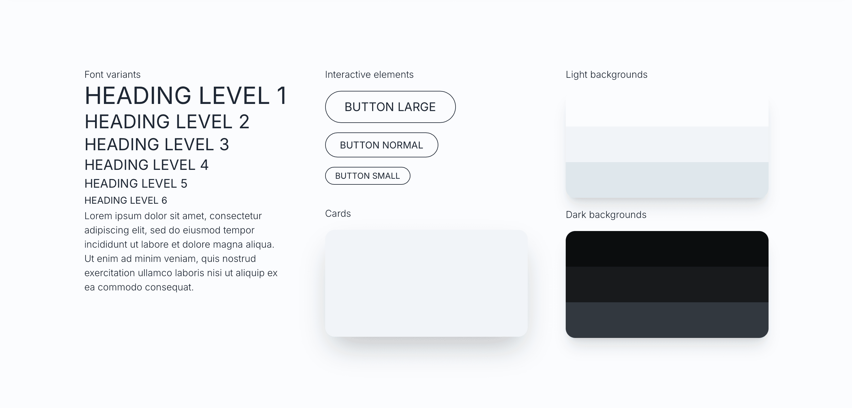
The design system uses several monochrome tones which are part of the strategy to use a blue color for key elements. The effect is that the reader's attention is drawn to those parts even stronger than it would be the case on a 'normal' site. There is only one font familiy for the sake of simplicity and rounded elements to make the site more approachable.
I hope this article gave you some insights into my approach to the redesign of my website. For more information feel free to go through my other projects as well or read my blog.